새소식
반응형
지난 글에 이어 오늘은 Next.js로 실제 개발을 해보겠습니다.
이번 포스팅은 2번째 챕터인 "Next.js로 웹 서비스 개발하기"입니다. 웹 서비스 개발편은 코드양이 많아 총 3장으로 나누어 작성했습니다.
1장에서는 컴포넌트 생성, 스타일 적용이 주 내용이며 2장에서는 생성한 컴포넌트를 활용해 계산 기능을 구현하게 됩니다. 마지막 3장에서는 카카오톡 공유하기를 통해 계산 결과를 공유해보겠습니다.
vscode를 실행하고 생성한 프로젝트를 열어보겠습니다.
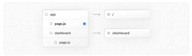
Next 13 버전부터는 디렉토리가 아래와 같이 생성됩니다.
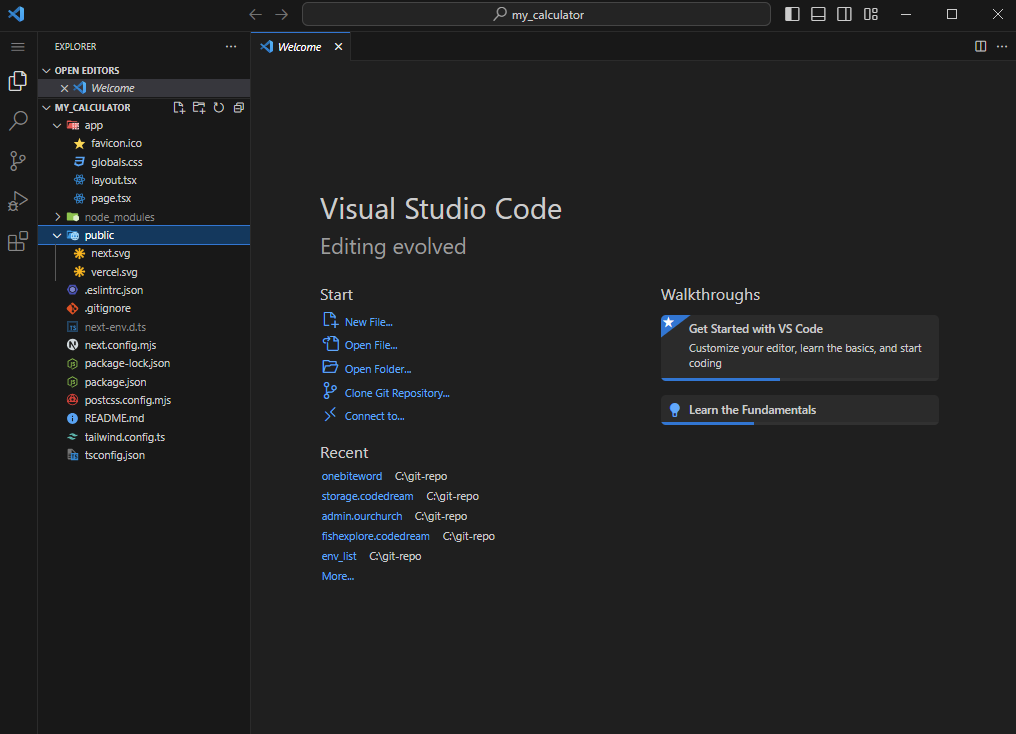
Next 13 버전부터는 앱 라우터 방식으로 app 디렉토리 안에 page.tsx(타입스크립트 미적용시 page.js)를 통해 페이지를 찾아가게 됩니다.
터미널을 실행(Ctrl + Shfit + `)하고 npm run dev를 입력합니다.
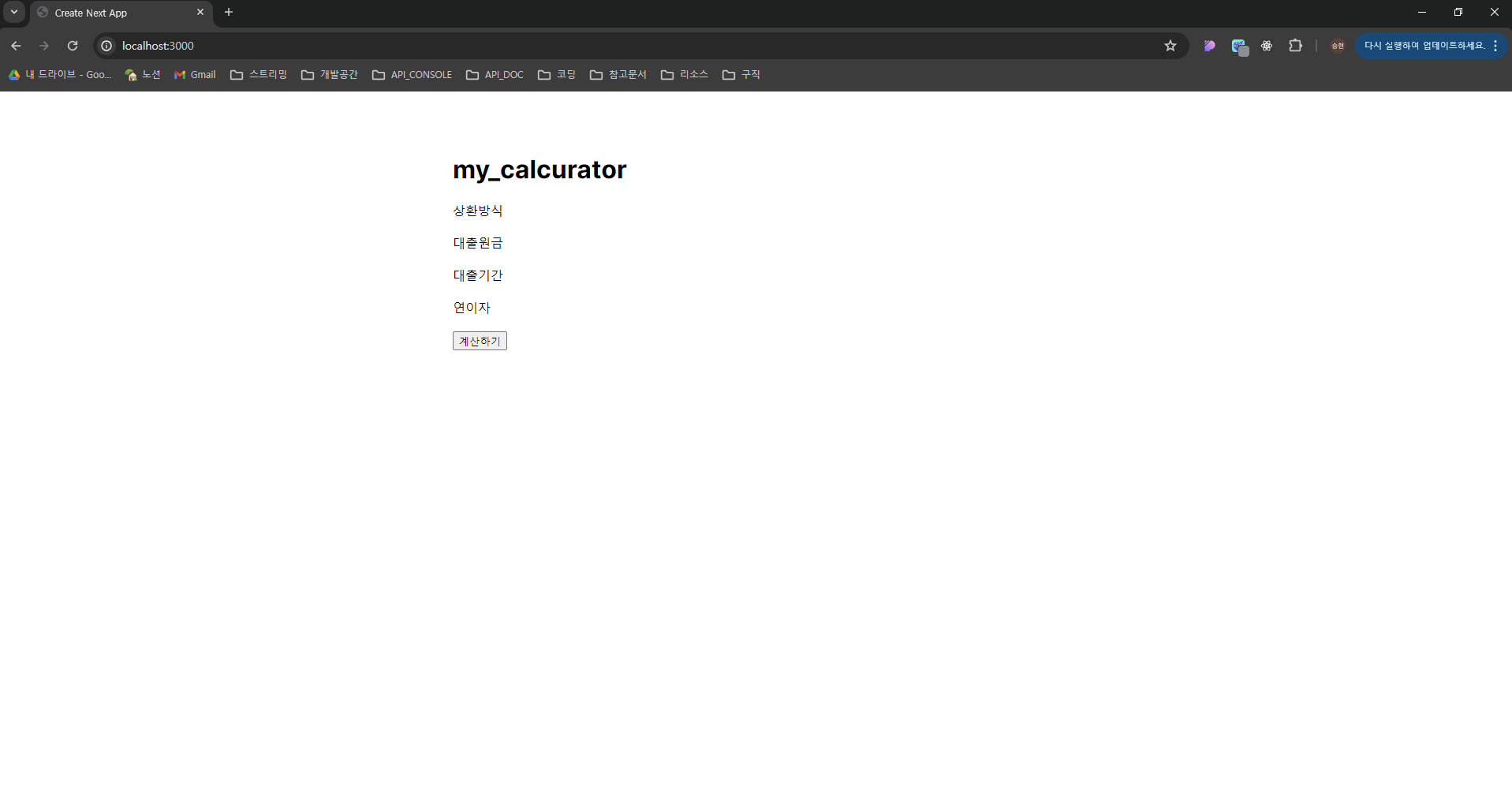
주소 창에 localhost:3000을 입력해 접속합니다.
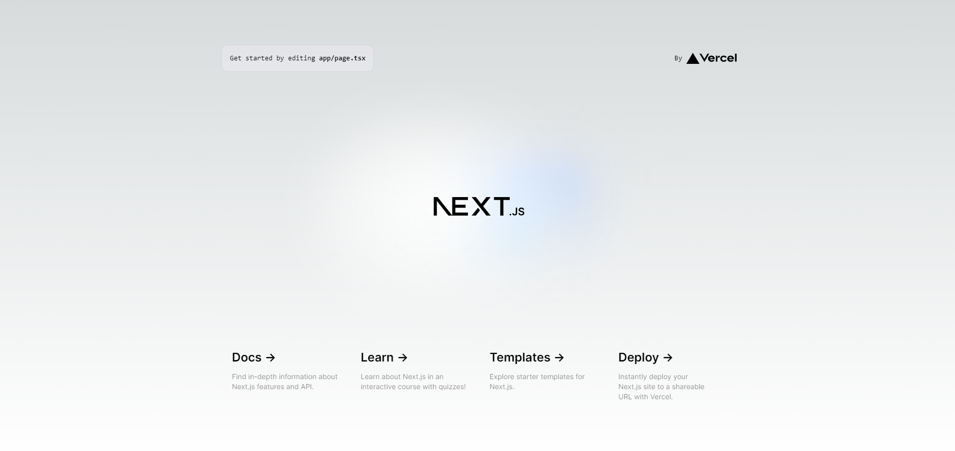
app/page.tsx가 실행된 화면입니다.
아래 더보기란을 확인하고 디버그 모드를 추가 설정합니다.
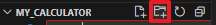
아래 표시된 영역 중 아무 파일을 클릭하고, 프로젝트 우측에 위치한 디렉토리 추가 버튼을 클릭합니다.
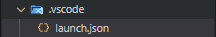
.vscode 라는 이름으로 디렉토리를 생성합니다. 그리고 launch.json 으로 파일을 생성합니다. 파일 안에 아래 코드를 붙여넣습니다. 이제 F5 버튼으로 프로젝트를 디버깅 모드로 실행할 수 있게 됩니다. (npm run dev를 입력할 필요가 없습니다)
{
  "version": "0.2.0",
  "configurations": [
    {
      "name": "Next.js: debug server-side",
      "type": "node-terminal",
      "request": "launch",
      "command": "npm run dev"
    },
    {
      "name": "Next.js: debug client-side",
      "type": "chrome",
      "request": "launch",
      "url": "http://localhost:3000"
    },
    {
      "name": "Next.js: debug full stack",
      "type": "node-terminal",
      "request": "launch",
      "command": "npm run dev",
      "serverReadyAction": {
        "pattern": "- Local:.+(https?://.+)",
        "uriFormat": "%s",
        "action": "debugWithChrome"
      }
    }
  ]
}
기획을 하며 확인된 입력칸은 총 4개입니다.
처음 기획한 대출 상환 방식은 사용자 측면에서 콤보 박스보다는 라디오 박스가 나을 것 같아 우측으로 수정하였습니다.
라디오 박스(Radio box)와 입력칸(Input box), 2개의 컴포넌트를 생성해보도록 하겠습니다.
컴포넌트를 생성해서 사용하는 이유는 여러 가지가 있지만 크게 2가지로 정리할 수 있습니다.
기본 틀 잡기
기존에 있는 app/page.tsx와 globals.css의 코드를 정리하고 기본 틀을 잡아보겠습니다.
모바일앱 환경을 고려해 미디어쿼리(@media)도 추가해놓습니다.
app/page.tsx
export default function Home() {
  return (
    <main>
      <div className="container">
        <h1>my_calcurator</h1>

        <div>상환방식</div>

        <div>대출원금</div>

        <div>대출기간</div>

        <div>연이자</div>

        <div>
          <button type="button">계산하기</button>
        </div>
      </div>
    </main>
  );
}
app/globals.css
main {
  padding: 50px 60px 150px;
}
main .container {
  max-width: 420px;
  margin: 0px auto;
}
main .container h1 {
  text-align: center;
  margin-bottom: 80px;
}
@media (max-width: 480px) {
  main {
    padding: 30px 15px;
  }
}
main .row {
  display: flex;
  flex-direction: column;
  margin-bottom: 40px;
}
main .row label {
  min-width: 120px;
  font-weight: 600;
  margin-bottom: 6px;
}
코드를 수정하면 화면에 바로 적용되는 것을 확인할 수 있습니다. 이는 Next.js에서 제공하는 Fast refresh라는 기능 덕분입니다.
디렉토리 생성
입력 컴포넌트를 만들어보겠습니다.
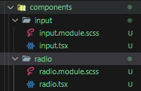
app/components에 radio, input 디렉토리를 생성합니다. 디렉토리 안에는 radio.tsx, radio.module.scss / input.tsx, input.module.scss 파일을 생성합니다. (포스팅에 사용되는 네이밍 규칙은 저만의 규칙이며, 정해진 답이 없기 때문에 소속된 회사 또는 팀 규칙에 따르는 것이 좋습니다)
라이브러리 추가
react-hook-form과 sass 라이브러리를 추가해줍니다.
react-hook-form은 React 기반 폼 관리 라이브러리로 효율적인 유효성 검사과 상태 관리가 가능합니다. react-hook-form을 통해 입력값을 체크해보겠습니다.
npm i react-hook-form
npm i sass
컴포넌트 생성
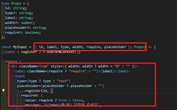
app/components/input/input.tsx
import { useFormContext } from "react-hook-form";
import styles from "./input.module.scss";

type Props = {
  id: string;
  type?: string;
  label: string;
  unit: string;
  width?: number;
  placeholder?: string;
  require?: boolean;
};

const MyInput = ({ id, label, unit, type, width, require, placeholder }: Props) => {
  const { register } = useFormContext();

  return (
    <div className="row" style={{ width: width ? width + "%" : "" }}>
      <label className={require ? "require" : ""}>{label}</label>
      <div className={styles.input_wrap}>
        <input
          type={type ? type : "text"}
          placeholder={placeholder ? placeholder : ""}
          {...register(id, {
            required: {
              value: require ? true : false,
              message: `${label}를(을) 입력해 주세요`,
            },
          })}
        />
        <span className={styles.span_wrap}>{unit}</span>
      </div>
    </div>
  );
};

export default MyInput;
app/components/radio/radio.tsx
import { useFormContext } from "react-hook-form";
import styles from "./radio.module.scss";
import { useState } from "react";

type OptionType = {
  value: string;
  name: string;
};

type Props = {
  id: string;
  require: boolean;
  options: OptionType[];
  label: string;
  width?: Number;
};

const MyRadio = ({ id, label, require, options }: Props) => {
  const { register } = useFormContext();

  const [selectedOption, setSelectedOption] = useState(options[0].value);
  const onChangeRadio = (e: OptionType) => {
    setSelectedOption(e.value);
  };

  return (
    <div className="row">
      <label className={require ? "require" : ""}>{label}</label>
      <div className={styles.radio_wrap}>
        {options.map((option, index) => (
          <label className={styles.radio_button} key={index}>
            <input
              type="radio"
              id={option.value}
              value={option.value}
              {...register(id)}
              onChange={() => onChangeRadio(option)}
            />
            <div className={`${styles.option} ${option.value === selectedOption ? styles.active : ""}`}>
              {option.name}
            </div>
          </label>
        ))}
      </div>
    </div>
  );
};

export default MyRadio;
앞서 컴포넌트를 사용하면 독립적이고 재사용이 가능하다고 했는데요. 이를 가능하게 해주는 것이 props입니다. 코드 상단에 선언된 타입을 통해 컴포넌트 선언시 파라미터를 전달할 수 있고 MyInput 컴포넌트의 옵션들을 설정합니다. (input 의 너비, 라벨명, id, placeholder 값 등)
이번에는 버튼 컴포넌트를 만들어보겠습니다.
입력 컴포넌트 생성때와 같이 디렉토리와 파일을 추가합니다.
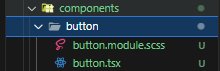
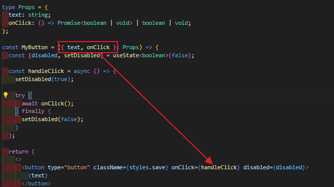
app/components/button/button.tsx
import { useState } from "react";
import styles from "./button.module.scss";

type Props = {
  text: string;
  onClick: () => Promise<boolean | void> | boolean | void;
};

const MyButton = ({ text, onClick }: Props) => {
  const [disabled, setDisabled] = useState<boolean>(false);

  const handleClick = async () => {
    setDisabled(true);

    try {
      await onClick();
    } finally {
      setDisabled(false);
    }
  };

  return (
    <>
      <button type="button" className={styles.save} onClick={handleClick} disabled={disabled}>
        {text}
      </button>
    </>
  );
};

export default MyButton;
버튼 컴포넌트는 이벤트를 props로 전달받게 되는데, 이를 통해 버튼 클릭 후 이벤트를 처리할 수 있게 됩니다.
이제 생성한 컴포넌트를 사용해 볼까요?
app/components/form 디렉토리를 추가하겠습니다. 그리고 form.tsx를 추가합니다. form 컴포넌트는 input, radio, button을 하는 갖고 있는 계산기 컴포넌트가라고 명칭하겠습니다.
app/components/form/form.tsx
"use client";

import { FormProvider, useForm } from "react-hook-form";
import MyInput from "../input/input";
import MyButton from "../button/button";
import MyRadio from "../radio/radio";

const OPTIONS = [
  {
    value: "1",
    name: "원리금 균등",
  },
  {
    value: "2",
    name: "원금 균등",
  },
  {
    value: "3",
    name: "만기일시",
  },
];

export default function Calcurator() {
  const methods = useForm({
    mode: "onChange",
    defaultValues: {},
  });

  return (
    <FormProvider {...methods}>
      <MyRadio id={"paymentMethod"} require={false} options={OPTIONS} label={"상환방식"} />
      <MyInput id={"amount"} label={"대출원금"} unit={"원"} />
      <MyInput id={"period"} label={"대출기간"} unit={"년"} />
      <MyInput id={"interest"} label={"연이자"} unit={"%"} />

      <MyButton text={"계산하기"} onClick={() => console.log("!")} />
    </FormProvider>
  );
}
가장 상단에 "use client"를 선언하는 의미는 form.tsx를 클라이언트 사이드 렌더링 방식으로 사용하겠다라는 의미입니다.
Next.js는 기본적으로 서버 사이드 렌더링 방식을 통해 웹 페이지를 그립니다.
클라이언트 사이드 방식에서 사용되는 useForm, useState 등과 같은 함수를 사용하기 위해서는 본인 또는 부모 컴포넌트가 클라이언트 컴포넌트여야 합니다. 때문에 form.tsx - input.tsx/radio.tsx/button.tsx를 부모 - 자식 관계로 만들어 부모 컴포넌트를 클라이언트 컴포넌트로 만든 것입니다.
더보기를 통해 import 단축키를 확인해 보세요.
import 단축키는 Ctrl + . 입니다. 오류 경고가 보이는 곳에서 단축키를 입력하면 아래와 같이 import가 가능합니다.
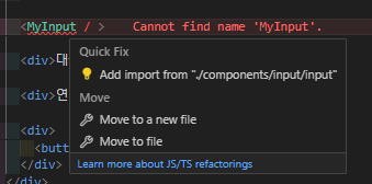
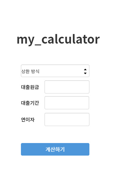
app/page.tsx에 계산기 컴포넌트를(form.tsx) 추가합니다. 계산기 컴포넌트는 자신이 클라이언트 컴포넌트로 작동되기 때문에 메인이 되는 app/page.tsx(서버 컴포넌트)에서 "use client" 선언 없이 불러와 사용할 수 있습니다.
app/page.tsx
import Calcurator from "./components/form/form";

export default function Home() {
  return (
    <main>
      <div className="container">
        <h1>my_calcurator</h1>

        <Calcurator />
      </div>
    </main>
  );
}
이제 다시 F5를 눌러 실행해보겠습니다.
컴포넌트가 잘 적용됐지만 화면이 조금 밋밋합니다. 간단한 css를 통해 스타일을 적용해보겠습니다.
css를 다룰줄 아는 분들은 이 부분은 넘기셔도 괜찮습니다.
버튼 스타일
버튼 스타일을 입힐 때 저는 주로 이 사이트를 이용합니다. 버튼 스타일 복사 후 button.module.scss에 붙여줍니다.
app/components/button/button.module.scss
.save {
  align-items: center;
  appearance: none;
  background-color: #efefef;
  border-radius: 4px;
  border-width: 0;
  box-shadow: rgba(45, 35, 66, 0.4) 0 2px 4px, rgba(45, 35, 66, 0.3) 0 7px 13px -3px, #d6d6e7 0 -3px 0 inset;
  box-sizing: border-box;
  color: #36395a;
  cursor: pointer;
  display: inline-flex;
  width: 100%;
  height: 48px;
  justify-content: center;
  line-height: 1;
  list-style: none;
  overflow: hidden;
  padding-left: 16px;
  padding-right: 16px;
  position: relative;
  text-align: left;
  text-decoration: none;
  transition: box-shadow 0.15s, transform 0.15s;
  user-select: none;
  -webkit-user-select: none;
  touch-action: manipulation;
  white-space: nowrap;
  will-change: box-shadow, transform;
  font-weight: 700;
}

.save:focus {
  box-shadow: #d6d6e7 0 0 0 1.5px inset, rgba(45, 35, 66, 0.4) 0 2px 4px, rgba(45, 35, 66, 0.3) 0 7px 13px -3px,
    #d6d6e7 0 -3px 0 inset;
}

.save:hover {
  box-shadow: rgba(45, 35, 66, 0.4) 0 4px 8px, rgba(45, 35, 66, 0.3) 0 7px 13px -3px, #d6d6e7 0 -3px 0 inset;
  transform: translateY(-2px);
}

.save:active {
  box-shadow: #d6d6e7 0 3px 7px inset;
  transform: translateY(2px);
}
입력칸 스타일
app/components/input/input.module.scss
.input_wrap {
  display: flex;

  input {
    margin: 0;
    padding: 13px 18px;
    border: 0;
    outline: 0;
    box-shadow: inset 0 0 0 1px rgba(0, 27, 55, 0.1);
    width: -webkit-fill-available;
    background: none;
    line-height: 1.2;
    color: #333d4b;
    border-radius: 8px;
    border-top-right-radius: 0;
    border-bottom-right-radius: 0;
  }
}

.span_wrap {
  display: flex;
  align-items: center;
  padding: 15px 18px;
  line-height: 1.2;
  font-size: 14px;
  min-width: 20px;
  color: #333d4b;
  text-align: center;
  white-space: nowrap;
  background-color: #efefef;
  border-radius: 5px;
  border-top-left-radius: 0;
  border-bottom-left-radius: 0;
}
라디오 박스 스타일
app/components/radio/radio.module.scss
.radio_wrap {
  display: flex;
  flex-direction: row;
  justify-content: space-around;

  input {
    padding: 0;
    border: none;
    position: relative;
    background-color: transparent;
    cursor: pointer;
    -webkit-appearance: none;
    -moz-appearance: none;
    appearance: none;
  }
  .radio_button {
    display: flex;
    width: 100%;
    gap: 8px;
  }
}

.option {
  width: 100%;
  display: flex;
  align-items: center;
  line-height: 1.2;
  border-radius: 5px;
  padding: 12px 20px;
  font-weight: 500;
  word-break: keep-all;
  cursor: pointer;
  background-color: #f9fafb;
}
.active {
  background-color: #0479f6;
  color: #fff;
}
폰트 적용하기
눈누에 접속해서 원하는 폰트를 클릭합니다. 웹폰트 사용에 내용을 복사합니다.
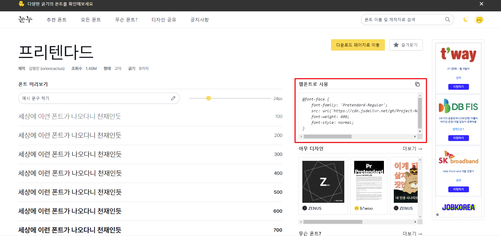
app/font.css 파일을 생성하고 복사한 내용을 붙여넣습니다.
@font-face {
  font-family: "Pretendard-Regular";
  src: url("https://cdn.jsdelivr.net/gh/Project-Noonnu/noonfonts_2107@1.1/Pretendard-Regular.woff") format("woff");
  font-weight: 400;
  font-style: normal;
}
추가한 파일은 app/layout.tsx에 import 시켜줍니다.
metadata에 title을 수정하여 사이트명을 바꿔줄 수 있습니다.
import type { Metadata } from "next";
import "./globals.css";
import "./font.css";

export const metadata: Metadata = {
  title: "Create Next App",
  description: "Generated by create next app",
};

export default function RootLayout({
  children,
}: Readonly<{
  children: React.ReactNode;
}>) {
  return (
    <html lang="ko">
      <body>{children}</body>
    </html>
  );
}
전체 스타일 수정
app/globals.css
* {
  font-family: "Pretendard-Regular";
  margin: 0;
  padding: 0;
}

body {
  font-size: 1.1rem;
  font-weight: 400;
}

main {
  padding: 50px 60px 150px;

  .container {
    max-width: 480px;
    margin: 0px auto;

    h1 {
      text-align: center;
      margin-bottom: 80px;
    }
  }

  .row {
    display: flex;
    flex-direction: column;
    margin-bottom: 40px;

    label {
      min-width: 120px;
      font-weight: 600;
      margin-bottom: 6px;
    }
  }
}

input,
select,
button {
  font-size: 1rem;
  font-weight: 400;
}

button {
  border: none;
  outline: none;
  background-color: transparent;
  cursor: pointer;
}
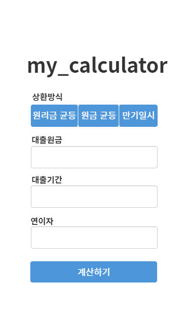
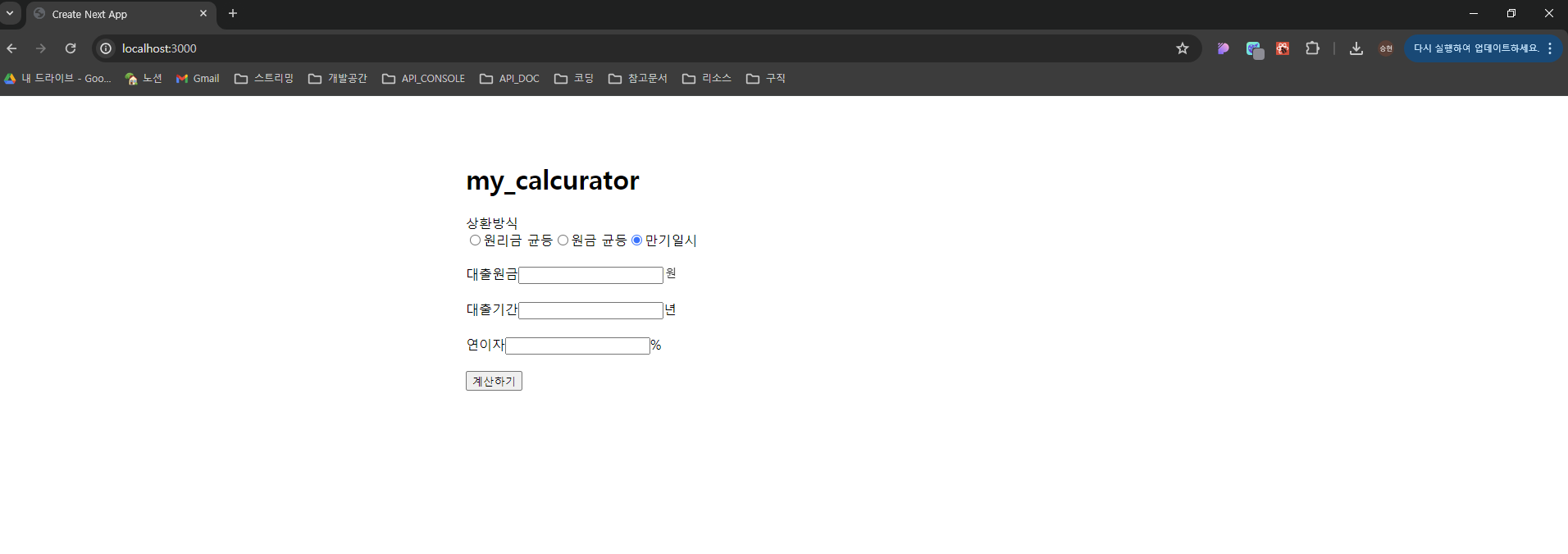
여기까지 스타일을 추가한 후에 F5를 눌러 실행해보겠습니다.
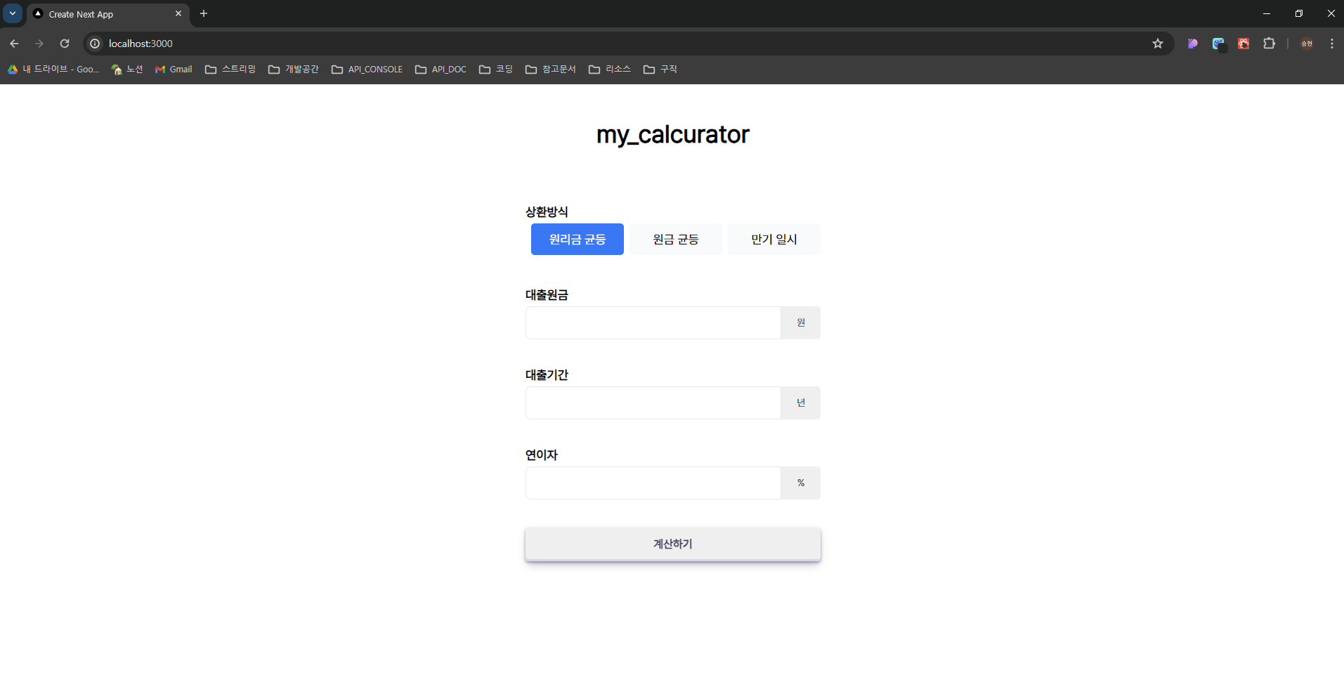
계산기 화면이 얼추 나온것 같습니다. 다음 장에서 값을 입력 받아 계산을 해보도록 하겠습니다.
전체 코드는 GitHub에서 확인하실 수 있습니다.
참고문서
Routing: Pages and Layouts | Next.js
Create your first page and shared layout with the App Router.
nextjs.org
아이콘 출처
Lucide Icons
Beautiful & consistent icon toolkit made by the community.
lucide.dev
| [토이프로젝트]Next.js를 이용해 대출이자계산기 만들어보기 - 2편 : Next.js로 웹 서비스 개발하기 (1) | 2024.04.27 |
|---|---|
| [토이프로젝트]Next.js를 이용해 대출이자계산기 만들어보기 - 2편 : Next.js로 웹 서비스 개발하기 (0) | 2024.04.25 |
| [토이프로젝트]Next.js를 이용해 대출이자계산기 만들어보기 - 1편 : 서비스 기획과 웹 프로젝트 생성 (0) | 2024.04.23 |
| React 맛보기 - React Hooks (1) | 2024.03.28 |
| React 맛보기 - React Component (0) | 2024.03.28 |
소중한 공감 감사합니다